Using Colour Strategically
The conventional advice — dark colours minimise, light colours emphasise — contains a kernel of truth but is too blunt a rule to be useful as absolute guidance. The more useful principle: colour value contrast draws the eye to where it appears. A bright or light colour against a dark background creates a focal point at the contrast point; a monochromatic look (single colour family top to bottom) elongates and unifies rather than drawing the eye to any particular area. For busty women who want to direct attention away from the chest, a monochromatic look or a relatively darker top with brighter bottom is more effective than the blanket dark-colours-on-top directive.
Pattern Placement
Pattern placement matters as much as pattern size. A large floral print across the chest emphasises its width; the same print on a skirt with a plain top directs the eye downward. Vertical patterns — stripes, elongated prints — create a vertical visual line that reduces apparent width regardless of where they appear. High-contrast patterns (black and white, bright geometric) draw attention; tonal patterns (tone-on-tone, texture prints) add visual interest without drawing attention to any specific area. For creator inspiration on bold pattern and colour choices on a curvy figure, follow Chimera Costumes on TikTok.
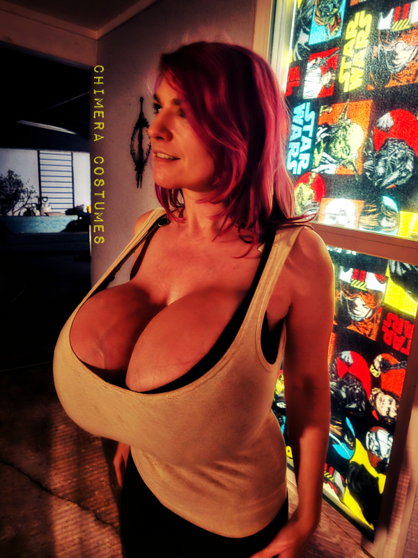
Chimera Costumes — Heidi Lange
Chimera Costumes builds elaborate corseted and structured costumes for her curvy, augmented figure. Her construction documentation is a masterclass in making fashion work for real bodies.
colour guide busty, pattern placement busty, colours for curvy women, colour choices big bust, pattern curvy fashion